Hello, lately due to my experiments i found cool way to create very simple and fast dark-mode for a website. It can took like just few lines of code to transform a website into dark-mode.
The one thing – to make it really simple your website needs to be monochromatic – for example black/white (or greyish) + one additional color.
You can of course expand this idea for more colorfull websites – but this will be much harder – cause you need to treat every color element seperately.
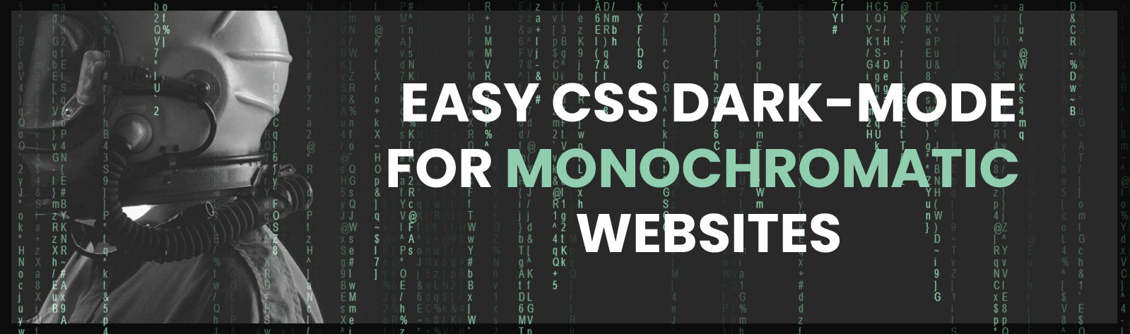
But lets go to the case. For example i got something like this:

This is one of my designs that i wanted to simply create dark mode from. I’ve done it on design in Photoshop but you can simply convert it also in CSS by adding just two layers (for example):
HTML Structure:
<body>
     <div class="dark-mode"></div>
     <div class="color-correction"></div>
     <!-- rest of the website -->
</body>
In above code i just created two <div>’s inside a body just above rest of the website and then you need to style them. Let’s firstly start styling first <div> to change website to a dark-mode. The style will look like this:
DARK MODE SWITCHER:
.dark-mode {
     position:fixed; // adding fixed - so it'll work on entire website regardless scroll
     width:100%;
     height:100%; // making div whole page size
     background-color:white; // this is important - cause this will convert colors to the dark-mode later
     mix-blend-mode: difference; // and this is where magic happens - cause it's turning all lighter colours into darker ones - pure black into pure black and light gray into dark grey
     pointer-events:none; // this is the last step - but also important cause we want our layer to ignore mouse clicks - so you can click layers below     z-index:10; // we want high z-index so it'll be show above all other layers - it can be as high as you can do.
}
And here you go – you already got dark-mode for the website switched on. But there is one problem – main color was also affected by the difference of .dark-mode. And here is what i’ve got:

As you can see – blue color was changed to red one. But don’t worry! correction is very simple – you just need to copy current (red color) add it to lower layer and apply different mix-blend-mode, so here you go with CSS code for .color-correction <div>:
.color-correction {
     position:fixed; // also fixed - so it'll work on entire website regardless scroll
     width:100%;
     height:100%; // making div whole page size
     background-color:#d95a20; // this is red color copied from example after adding .dark-mode layer      mix-blend-mode: hue; // and that does the trick - cause all hue is translated to red before dark-mode - that way dark-mode will switch it back to blue
     pointer-events:none; // same as above
     z-index:9; // and this is important - so z-index should be at least one number below .dark-mode <div>
}
And this is exactly what final dark-mode looks like:

Pretty cool – with adding just two <divs> and a little bit of style huh?
As i mentioned below – you can do that with this simplicity only on website that got one color except black and white – otherwise you’ll need to make color-correction for every single color – so it will not work.
After that – you can use JavaScript just to create a button for switch and change the opacity of the divs – either in CSS with added class or straight in JavaScript – but i presonally prefer using it for classes manipulation and then work directly in CSS.
And that’s it – thanks and happy coding.